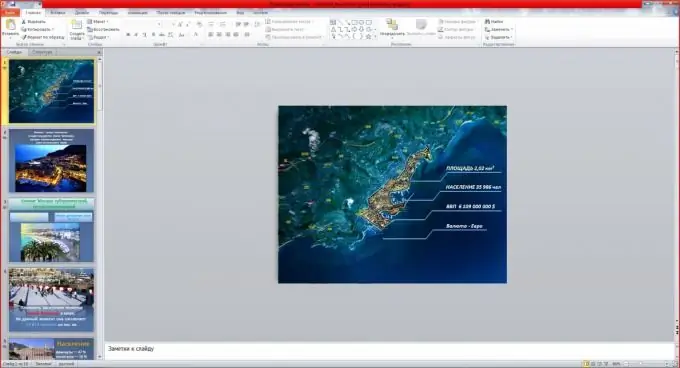
Computer technology has spread across the globe. It is difficult to imagine a person who does not use electronic devices in their daily life. And there is a reason for this - they are very convenient and multifunctional. With the help of a modern telephone, you can not only make calls, but also search for information on the Internet, take photos and videos, etc. Presentations are also a practical invention, which is now very relevant. But what should the presentation look like?

Instructions
Step 1
Simplicity and brevity.
The main point of the presentation is to convey the meaning to the audience. Huge texts on the slide will not attract attention, but rather, on the contrary, will remove viewers from the show. It will be much better if one thesis (one sentence) is highlighted on the screen, which, if necessary, the narrator will reveal in his speech.
Step 2
Background.
In order not to distract the audience from the meaning of the speech, you need to choose a neutral, monochromatic background. Various catchy photos and pictures will transfer interest to themselves, and then the viewer will be distracted from the main performance.
Step 3
Visual applications.
Most people perceive visual information better than textual information, so use visuals to draw attention to your presentation. These can be photos, tables or diagrams that will clarify the meaning of what you said.
Step 4
Music.
It happens that presentations require audio, but in most cases this is completely useless. Rather, even distracting, because it is difficult to perceive both text and auditory at the same time. However, if you do decide to use music, do not make it too loud, so as not to try to shout it down during the performance.
Step 5
Completion.
On the last slide, you can thank the audience for listening to your talk. This is often expressed by the simple phrase "Thank you for your attention!"


