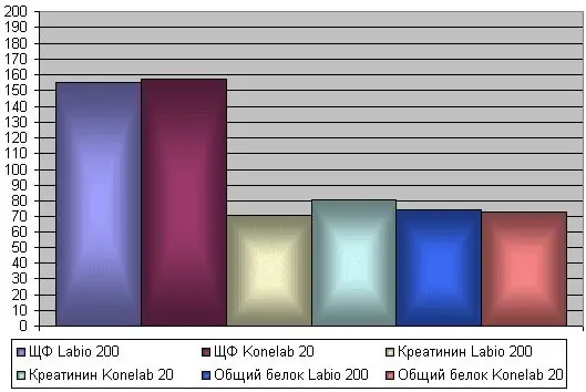
Charts provide a means of visualizing data and make it easier to compare data, identify patterns and trends. Rather than analyzing multiple columns of numbers on a worksheet, it is better to take a look at a chart and see how raw material production changes by quarter, or how actual production compares to planned production. You can create a regular graph or a 3-D Pie, Cylindrical, even exotic Radar or Bubble chart.

Instructions
Step 1
To build a chart, first enter the required data on a sheet in the form of a table. After the table with the data is ready, select this data, use the Chart toolbar to build the main chart. Select a type and specify any other required chart options. You can create a chart on a new separate sheet, or place an embedded object on a data sheet. Use Chart Sheets when you need to analyze or modify complex charts separately from the underlying data, or when you want to conserve screen space for working with the worksheet.
Step 2
Microsoft Excel creates axis values from worksheet data. To edit the data, hover the mouse over the chart area and right-click on Chart Options. A window with several tabs will open in front of you. Select the bookmark you need. You can make adjustments to the legend, change the division of the axis, add additional grid lines, change the color of the columns at your discretion.


