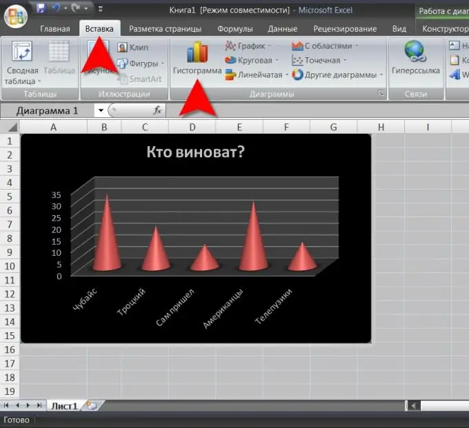
A histogram is one of the options for graphical display of tabular data, in which the distribution of data relative to one of the graph axes is represented in the form of rectangles of different heights. The width of the rectangles (i.e., the step of changing the data relative to the second axis) is, as a rule, the same. It is convenient to build charts of this type in the Microsoft Office Excel spreadsheet editor.

Necessary
spreadsheet editor Microsoft Office Excel 2007
Instructions
Step 1
Start building the histogram by highlighting the required data in the table. They must be in the cells of the same column or row. If the adjacent column (line) contains titles (names), then you can select it too - these values will be used to build the “legend” of the histogram.
Step 2
Then go to the "Insert" section of the editor menu and click the largest button in the "Charts" section - "Histogram". A list of design options will open, divided into five groups - from simple flat to volumetric conical. Choose the one that suits you best.
Step 3
Excel will build a histogram based on the tabular data you specified and immediately turn on the editing mode. The number of menu tabs will increase by three - "Design" (it is enabled by default), "Format" and "Layout" will be added.
Step 4
The Chart Styles and Quick Layout sections of the Design tab offer a wider selection of bar chart styling options, and the Data section allows you to change the cells that the chart or header cells are based on. In the "Type" section, you can change the histogram to a pie chart or another variant of data presentation, and also save the design you edited as a template for later use. The histogram can be moved to another sheet or to another location of the current sheet using the button in the "Arrangement" section. You can move it with the mouse.
Step 5
The "Format" and "Layout" tabs contain tools intended for more detailed adjustment of individual elements of the histogram design.


