In the last century, when the technologies of color photography were not very accessible, the production of supposedly color photographs by touching up black-and-white photographs with special paints was a special glamor of some photo studios and handicraftsmen. It looked naive. Now, at the service of a modern person there is computer technology and the Adobe Photoshop program, with the help of which black-and-white images can also, in fact, be colored, but at the same time they acquire a completely realistic color appearance.

Necessary
To perform the operations of this instruction, it is desirable that you are at least basic familiar with the Adobe Photoshop program: you know what layers and layer masks are, and know how to use a brush and other basic tools of this program
Instructions
Step 1
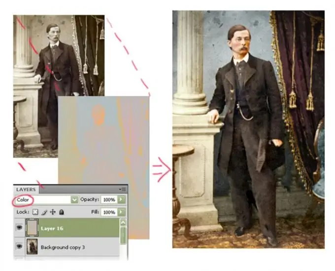
To add color to an image - bring back the color of a black and white or faded photograph, color or recolor a pencil drawing or monochrome illustration, etc. - no special technical costs and complex operations are required. It is enough to open the original image in Adobe Photoshop, create a new layer over the base image, and put it in Color mode, apply fragmentary areas of the required colors on it. This can be done with a brush or other tools in the program. The original image will acquire the desired color gamut in the right places.
Of course, the hardest part is actually making the color layer correctly, especially if you want to achieve the most photorealistic color image.

Step 2
To begin with, let's conduct an analysis: let's study the original image and mentally try to divide it into more or less large fragments, the color inside which should be fairly uniform. These are, for example, objects made of one material, or objects with a completely predictable combination of colors, monochromatic arrays - foliage, grass, walls, floors, etc. The main thing is that the colors inside such a fragment obey a single simple law: dark, shadow areas tend to one color, areas of medium illumination have their own approximately the same shade, and light areas have their own.
For each such homogeneous fragment, you can create your own color layer that describes the required regularity.
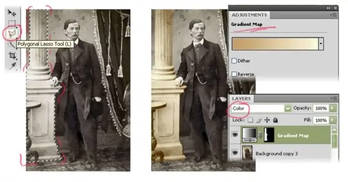
First of all, let's create a layer mask so that the coloring action will only apply to the desired fragment of the original image. For example, let's trace the outline of an object with the Lasso tool. With the selection finished, create a new Gradient Map layer (Menu Layer> New Adjustment Layer> Gradient Map). In the layers panel, switch the blend mode switch of the created layer to the Color value.
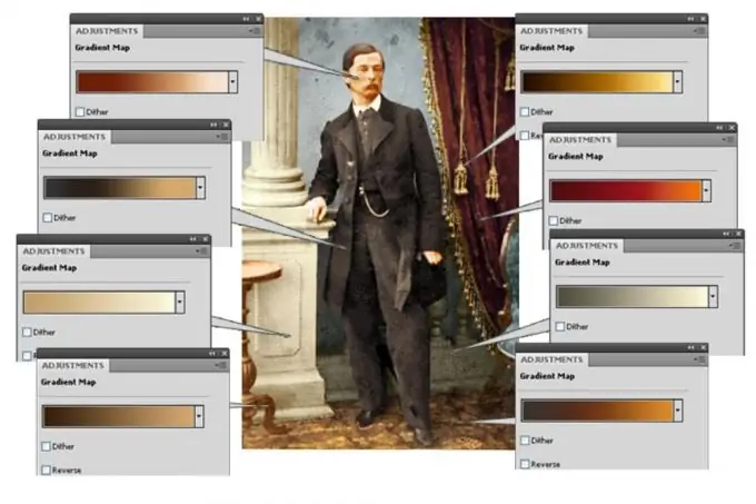
Let's start creating a spectrum of the gradient. On the left in the gradient there will be colors responsible for the dark areas of the image, on the right - for the light ones. If you have good visual memory and artistic taste, the colors can be chosen "by eye", however, a pre-prepared sample photograph, the nature of the image in which is similar to the recreated picture, will greatly facilitate the work. On this sample, the basic color combinations will already be presented in the finished form, therefore, the colors of the gradient can simply be typed with an eyedropper tool from the sample. One way or another, we select the color and location of the markers on the gradient, visually controlling how believable the result is.

Step 3
You can create as many such layers. Each layer in the list of layers above can overlap the layers below, and if the layer masks overlap, then the top layer will be decisive in the color cast. Therefore, you can go initially from painting large spaces, to the subsequent creation of smaller color fragments, superimposing new color combinations on smaller and smaller details, creating new and new layers on top.
Of course, layer masks can be created not only by tracing objects along a path. The mask can be simply painted with a black or white brush, respectively, adding or excluding the areas of action of the color layer. In order to "paint on the mask", you must first click on the rectangle on the right - a schematic image of the mask - in the line of the desired layer on the Layers panel.
It is very convenient that each created layer can be re-edited at any time, change the colors of the spectrum - for this it is enough to double-click on the layer line in the list of the Layers panel and go to the gradient modification. Also, the mask of each layer can be erased, corrected, painted over, or even created anew.

Step 4
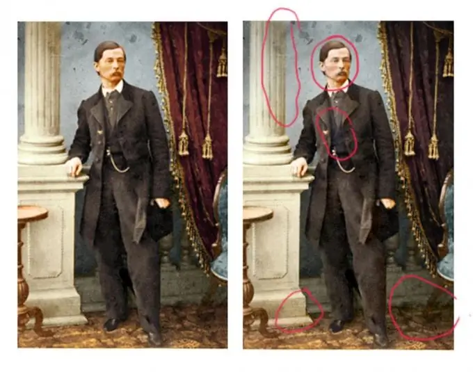
Having colored large homogeneous areas of the image in this way, we proceed to the next stage - the stage of manual refinement. This requires observation and logic. The fact is that even surfaces of the same color, which have a completely uniform color, never look monotonous in real optical conditions. Light falls on each surface: direct - from light sources, reflected - from adjacent surfaces, in addition, when the observer looks at different angles, the same color tone looks different. Therefore, in addition to color gradients, which tend to "flatten" surfaces. with this method of painting, the volume and location in space are not taken into account, - we will create additional color layers that correct them.
For example, in the proposed picture, the color of the light column in the upper part will tend to blue, because next to it is a large blue wall, the reflected cold color of which will surely fall on the column and illuminate it, changing the color shade. The lower part of the column closer to the floor will receive the reflected orange highlights from the parquet.
To show this in our work, just above the Gradient Map layer that defines the base color of the column, create a new blank layer (Menu Layer> New Layer), and switch it to Color blending mode. On it with a soft translucent brush, carefully apply the necessary spots - a cold shade at the top, a warm orange at the bottom. You can also play along with the brown reflexes from the walnut table next to it. By adjusting the Opacity parameter of the created layer, you can decrease and increase the influence of the adjustment layer on the image.
Another optical law, where there is less illumination, the colors are faded, where there is more light, in addition to the actual brightness of the image, the color saturation itself will be an order of magnitude higher. This, for example, must be taken into account when giving color to the floor: in the proposed illustration, in the shadow areas, the reddish color of the parquet will look more faded. And in the darkest places, the colors of all surfaces can have an almost indistinguishable color tone from each other.
Special attention should be paid to the human skin. First of all, the skin absorbs glare very well, therefore, for example, in the character in the picture, the side of the face that faces the column will be a much colder shade than the one on which the light from the red curtain falls. In addition, the skin itself rarely has an even color - the cheeks are usually warmer than the skin around the eyes, open areas are tanned, blood vessels will be visible through thin skin, etc. Therefore, working on skin color is always very painstaking, but with sufficient observation, with a little practice, you can easily achieve a completely believable result.

Step 5
It is recommended to save the final image in two different formats. Firstly, in the format of the Abode Photoshop program, where information about all created layers will be saved, which will make it possible to further modify and supplement the image. And secondly, in a commonly used format, such as JPEG, for quick viewing, transferring and other operations with the file, in which there is no need for layer-by-layer editing. This can be done through the File> Save As menu, specifying the file format, its name and storage location on disk. And in a format suitable for transportation on the Internet, it is easy to save the image through the File> Save for Web menu.


