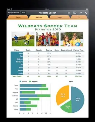
Any text, even a very literate and meaningful one, requires illustrations. If it contains many different comparative data, tables, then the desire arises to see them not only in the form of dry numbers, but also in the form of graphs and diagrams. They more clearly show what is presented in tabular form. Moreover, this can be done without the help of all kinds of graphic editors right in the program where you prepared the tables - in Excel.

Instructions
Step 1
First, draw up the table you want. Assume that the graph has two axes - horizontal (X-axis) and vertical (Y-axis). Accordingly, in the table, these will be columns and rows. The names of the columns and rows will hereinafter be the names of the axes. Example of a table.
After the table is built, select it and click the "Chart Wizard" button. By default, it is located on the standard toolbar next to the help icon. The Chart Wizard (Step 1 of 4): Chart Type window opens. In this window, select the graph option that suits you best. To find out how your data will look in one way or another, there is a button "View results". Click on it and hold it for a while - in the "View" place, a graph will be displayed in relation to your table. If you did not find the one you need among the standard diagrams, look at the "Non-standard" tab.
Step 2
Having decided on the type of chart, click the "Next" button - go to step 2. At the top of the window is a sample of your future chart, then "range" is the selected area. If you forgot to select the table at the beginning, or want to change the selection, change it here. Also, by changing the "Rows in Rows / Columns" pointer, you can change the data along the X and Y axes. The result is visible immediately, if you don't like it, return it as it was.
Step 3
At step 3, you can set all the necessary parameters: the designation of the axes, the color and thickness of lines, fill, markers, font, etc. Including here, in the "Legend" tab, create it (by checking the corresponding box), define the position by in relation to the schedule. The legend is needed in order to immediately see which data on the chart means what. Here you can attach tabular data to the chart.
Step 4
At the final step, choose how you want to see the created graph, chart - on the same sheet as the table, or on another (you can select any existing sheet in the book or create a new one). Having selected, click on the "Finish" button. Your graph will look like this.
Step 5
If suddenly, for some reason, you are not satisfied with the result, it is easy to fix it. You can correct the chart directly in it (by right-clicking from the context menu) or in the main menu "Chart". The sub-items on this tab contain all four steps discussed above.
Now you know that by changing the data in the main table, you will immediately get an updated graph. The benefits are obvious - you don't need to make a new schedule every time, update it at least hourly. It is on this principle that various daily, monthly and other reports are formed - colorfully and clearly.


