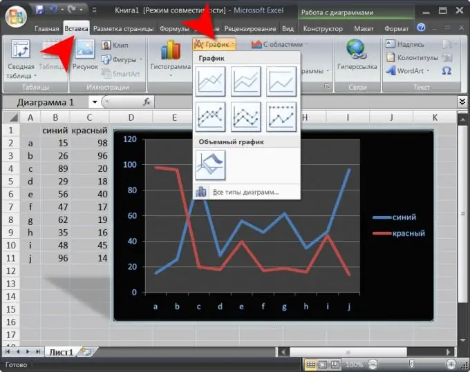
In the Microsoft Office Excel spreadsheet editor, there are no functions allocated in a separate block for creating and editing graphs. For the visual presentation of tabular data, the group of commands "Charts" is intended here, and several types of charts are included in it as special cases of charts. However, this does not in any way affect the breadth of possibilities that this spreadsheet editor provides for presenting data in the form of graphs.

Instructions
Step 1
Start Microsoft Excel and load a spreadsheet containing the data to be plotted into it. Or create a new document and fill it with the required data.
Step 2
Select the range of cells in the spreadsheet that you want to plot. In addition to the data itself, you can also select a column with a row that contains headers. In this case, the values from the cells of the left column will indicate the divisions of the horizontal axis (X-axis) of the graph, and the values of the top line on the legend will label the corresponding lines of the graph. It is recommended that the number of data columns, and hence the number of lines simultaneously displayed on the chart, should not be more than seven.
Step 3
Select the "Insert" tab in the menu of the spreadsheet editor and click on the "Graph" icon placed in the "Diagram" group of commands. In the drop-down list of seven design options, select the most suitable one. The spreadsheet editor will create a graph based on the layout you selected, built from the data in the selected table cells. This will use the default appearance settings. To change them, Microsoft Excel will add three more to the menu tabs - "Design", "Format" and "Layout".
Step 4
Replace the skin used by the spreadsheet editor when creating the graph, if necessary. To do this, on the "Design" tab, there are the "Chart Styles" and "Chart Layouts" drop-down lists. In addition to choosing preset options, you can independently create your own chart design option based on them, using the tools located on the "Format" and "Layout" tabs.
Step 5
Save the edited version of the chart design if you intend to use it in the future. To do this, on the "Design" tab, there is a button placed in the "Type" command group. In the group of commands "Data" there is an icon that swaps the coordinate axes, that is, transpose the data. Another button in this group of commands is designed to change the range of cells on the basis of which the graph is built.


