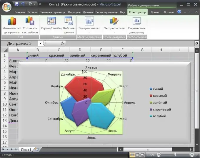
Charts are used in the spreadsheet editor Microsoft Office Excel to better visualize data from spreadsheets. A petal chart is one of the variations of a pie chart, but here it is separated into a separate type. This form of data presentation is convenient to use, for example, to display several groups of data distributed by months of the year.

Instructions
Step 1
Start the spreadsheet editor and load the document, the data of which should be presented in the radar chart format.
Step 2
Select the range of cells you want to include in the chart. If this range has column and column headings, then they can also be selected - Excel will be able to distinguish labels from cells with data and include them in the chart as a "legend" and labels for sectors. It is desirable that the number of columns with data does not exceed seven - this is the recommendation of Microsoft Corporation.
Step 3
Go to the "Insert" tab in the spreadsheet editor menu and in the "Diagram" command group click on the "Other diagrams" button. The bottom line of the drop-down list contains three radar chart options - select the one you want. Excel will perform the necessary actions and place the finished chart on the same page of the document. At the same time, three additional tabs will be added to the editor menu for editing the diagram - "Layout", "Format" and "Design". By default, the "Design" tab will be activated.
Step 4
Expand one of the drop-down lists in the "Chart Layouts" or "Chart Styles" command groups if you want to change the appearance used by the editor when creating a chart. These lists contain ready-made design options, and on the Layout and Format tabs you can independently customize almost every aspect of the radar chart appearance - pick colors, bump, material, shadows, color fill options, move labels or turn them off, etc..d.
Step 5
Use the buttons in the Data command group of the Design tab if you want to change the range of cells used to generate the chart, or the row and column that contain legend titles. The "Type" group of commands on this tab contains a button for saving the created design variant as a template and a button for replacing a radar chart with a chart of some other type. The button in the "Arrange" command group is intended for moving the diagram both within the current sheet and on other sheets of the book.


