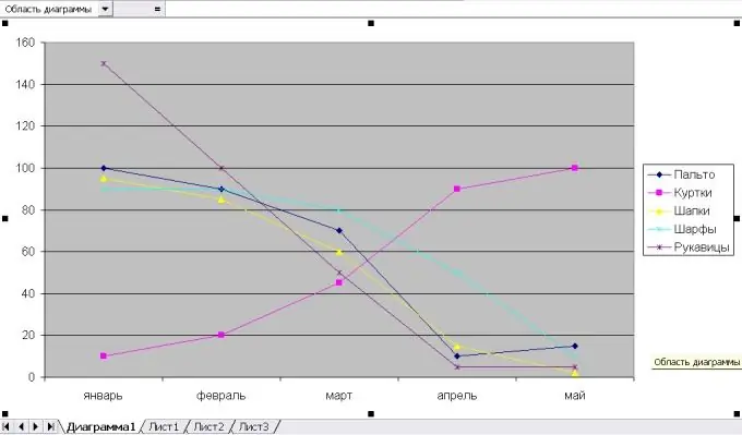
It is very convenient to use charts to illustrate a variety of statistical and scientific data. The spreadsheet editor Microsoft Excel offers a large number of standard charts and allows you to create complex combinations from ready-made templates.

Instructions
Step 1
Before building a graph, create a table that contains the source data, and select any cell in it. Then you can act in different ways:
- in the "Insert" menu, select the "Diagram" item;
- on the toolbar, click the "Chart Wizard" button;
- press the F11 key.
Excel will create the chart on a separate sheet using the default settings. Since a chart is built by default, go to the Chart item of the main menu and open the Chart Type list to select a chart.
Step 2
Check the "Graph" item in the "Type" list. There are 2 tabs in the Chart Wizard window: "Standard" and "Non-standard". Among the non-standard graphs, Excel offers combined ones, for example, a graph with a histogram or a graph with two axes of values. Click Next.
Step 3
In the "Range" tab, specify the range of values by which the graph will be built. By default, the program considers the entire table. In the "Rows in" section, mark which value will be indicated on the abscissa: columns or rows. Click "Next" to continue.
Step 4
Set chart parameters:
- in the "Titles" tab - the name of the chart and the titles of its axes;
- "Legend" - placement of the legend on the sheet relative to the chart;
- "Data table" - whether it is necessary to show the table simultaneously with the graph;
Click "Next" to proceed to the next step.
Step 5
Indicate where the schedule will be placed: on a separate sheet or on the current workbench.
Step 6
If you want to change the thickness and color of a line on the graph, select the required data series and open the "Format" item in the main menu. Choose the "Selected Row" command. In the "Data Series Format" window, by going to the appropriate tabs, change the appearance of the graph line and marker. You can choose the color and thickness of the line and the geometric shape of the marker; add legend and data labels; build projection lines on the coordinate axes, etc.


