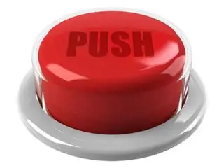
If you decide on your own to create a button for the navigation bar of your site, it is quite simple to do it using the Adobe Photoshop program. As a result, you will get a pretty nice button that you can adjust in color and other parameters exactly to the design of your site.

Instructions
Step 1
Create a new document in the program (File - New or File - New). Now switch the document to gray mode, for this select Image - Mode - Grayscale. Now, using the Rectangle Tool, create a rectangle that matches the dimensions of your future button. Now put the image in RBG mode. Open the RBG palette (left) and set all values to 170. Fill the rectangle with gray.
Step 2
Now click Image - Mode - Bitmap to put the image in Bitmap mode. In the Bitmap window, in the Use list, select the Halftone Screen value. Another window should open. In this window, set the following parameter values:
Frequency: 256
Lines / inch
Angle: 45
Shape / Round
You will end up with a rectangle speckled with stars.
Step 3
Now switch the image back to Grayscale mode (Image - Mode - Grayscale). Set the Size Ratio 1. Set the image back to RBG mode. Apply filter Stylize - Fmd Edges.
Step 4
Then apply the filter Blur - Motion Blur, in it set the following parameters:
Angle - 36
Distance - 19
These values are optional, you can accept your own, depending on the result you want to get in the end. This applies to all the parameters given in this manual - try experimenting and see what you get, perhaps you will be satisfied with some other option, different from what the author of the instruction will end up with.
Step 5
Now color in your image. To do this, select Image - Adjustements - Hue / Saturation. There, check the box next to Colorize and, moving the levers, select the desired border color for your button.
Step 6
Now select the protruding part of the button with the Rectangular Marquee Tool and make it a little lighter. To do this, change the curves of the image - Image - Adjustements - Curves.
Step 7
If you are already satisfied with the result, you can stop there and consider that your button is finished. But if you want, you can tweak the image a little more to make it look better.
Step 8
To do this, we need to get rid of the cut corners. Select the Rectangular Marquee Tool and select the area of the button that you need (no ugly corners) and copy (Edit - Copy or use the Ctrl + C keyboard shortcut). Then press Ctrl + V to paste the copied one onto a new layer. Apply Image - Rotate Canvas - Flip Horizontal.
Step 9
Select the desired fragment again, copy and once again apply Image - Rotate Canvas - Flip Horizontal. Thus, the image will return to its original appearance. Now delete this fragment (as a rule, this is the topmost layer in the layers panel). Now paste the snippet from the clipboard using Edit - Paste. Drag the piece to the left edge of your button, make the edge rectangular. Do the same with the right corner.
Step 10
Now you need to add text to the button. To do this, use the text tool to create the necessary inscription, changing the color to a more appropriate one. Apply a Blur filter to the button to blur it a little.


