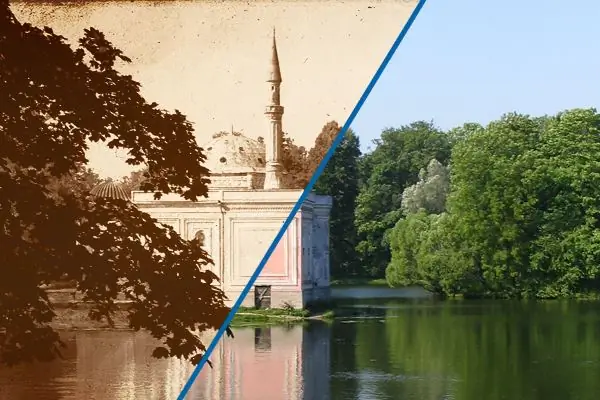
Sometimes in the work of a designer, the task arises of aging a photographic image. There are many ways to achieve the "retro" effect, one of them - quite simple and accessible even to a not very experienced user - will be discussed in this manual.
Necessary
- To follow these instructions, you need some basic knowledge of Adobe Pkotoshop, namely: Recommended
- - have an idea of what layers are and how to work with them,
- - imagine what a gradient is and be able to change its color composition,
- - and you also need to imagine how to use a Photoshop brush in the program.
- Otherwise, no special knowledge and skills are required, just read the instructions and look at the accompanying pictures.
Instructions
Step 1
Before getting started, we need to stock up on a few images.
- firstly, of course, this is the original photograph itself.
- secondly, we need a file with the texture of old paper, it is easy enough to find it on the Internet, just type this phrase in a search engine.
- thirdly, we need a sample of some old photograph, based on which we will stylize our image. We also need this landmark in order not to invent and not take the color and dynamic characteristics of the final file "from the ceiling".
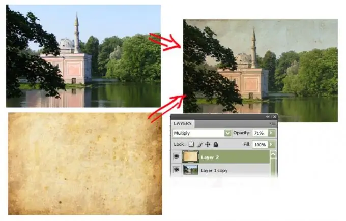
Open the original image in Photoshop. Copy the texture file as a new layer. Set it to the Multiply blending option. The size of the texture, as a rule, does not coincide with the size of the original image, which means that it needs to be adjusted in place and dimension. To do this, press the Ctrl + T keys or select the Edit> Free Transform command from the menu and, using the square handles at the corners of the layer, stretch and move the images until we find the best overlay option.
Step 2
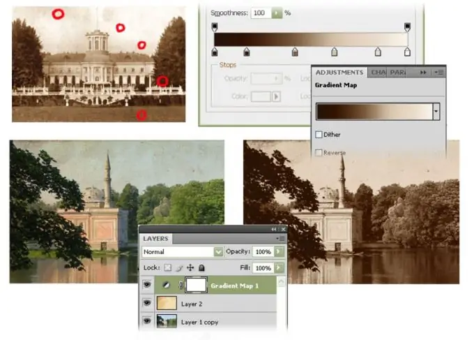
We give our picture the color and contrast typical for old photographs. Let's use a sample photo for this.
Having created a new Gradient Map layer in our composition (menu Layer> New Adjustment Layer> Gradient Map, or by clicking the corresponding button at the bottom of the layers panel, and choosing the Gradient Map type), load it with our own gradient. It will consist of flowers taken from a sample of an old photo. On the left side in the created gradient there should be dark colors, they should be taken (with the eyedropper cursor) from the darkest places of the source, on the right there should be shades of light tones, and the corresponding points can be easily found on the original. We select the location of the color swatches on the gradient so that our image resembles the photo-guide as much as possible.
Step 3
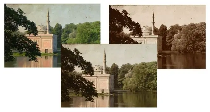
By the way, the resulting layer, which now determines the color of our photo, can be varied in transparency (changing the parameter of the Opacity layer), achieving stylization not only for an old black-and-white photo, but also getting the effect of a half-faded aged color image.
Step 4
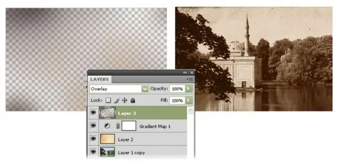
Now we can manually add nuance to the color and light palette of the final image. Having created a new layer and switched it to the Overlay mode, we can apply dark and light strokes on it with a large soft brush, which will lighten or shade some parts of the photo, giving it a natural color distortion - a real photograph for its long life could lie on the sun, then get under the influence of chemicals, get wet, etc., and even at the negative stage, the technical imperfection of the production of those times meant the unevenness of the coating and the effect of reagents.
Step 5
The final image can be adjusted again for hue and saturation using the Levels and Hue / Saturetion tools from the Image> Adjustments menu. In addition, you can artificially add graininess to the image, through the menu Filter> Noise> Add Noise. And also, using the Image> Adjustments> Shadows / Highlights transformation, experiment with the zonal contrast of the original image, increasing it in shadow areas or highlights, giving the the clearest details and changing the dynamic range of the photo.


